sweargirls creative
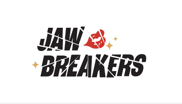
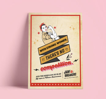
jawbreakers branding | internal women's group
In an industry where creative leadership has historically been male-dominated, we created Jawbreakers as an internal women’s group and ally space for women and other marginalized voices. The branding carried an edgy confidence, with headlines like “Crushing Stereotypes” and a bold poster declaring, “There’s a special place in hell for women who don’t help other women,” plus a call to action, “Join the Rebellion” to rally solidarity and support.


windstar cruises | direct mailer
For Windstar Cruises' first-ever Middle East sailing under the "Windstar Knows the Way" campaign, I challenged the team to elevate beyond basic postcards with fresh fold ideas. After some research, we landed on a unique die-cut fold, metallic ink, and spot varnish that added interactivity and tactile appeal. The piece engaged recipients by literally drawing them into the brand experience, and the client loved its fresh, sophisticated approach.
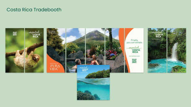
costa rica | tradebooth
This tradebooth layout brought the new Pura Vida branding to life with a simple, clean design that let powerful, authentic images carry the story. The challenge was to keep it minimal while staying true to the brand's vibrant essence.

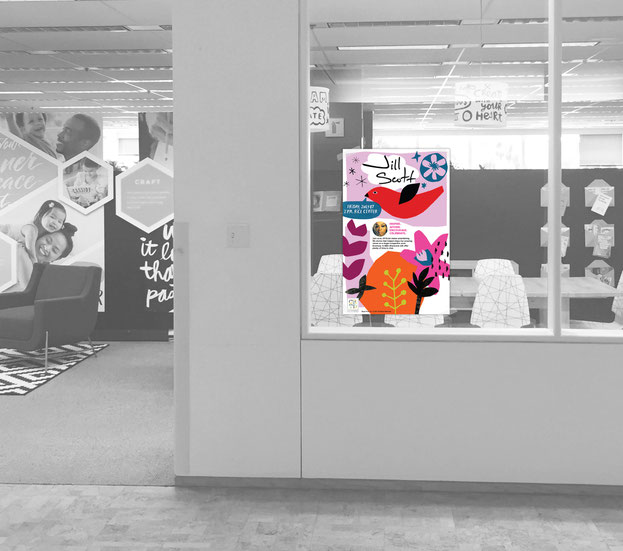
hallmark | internal creative symposium poster
While contracting with Hallmark, I designed an internal poster promoting an in-house event for Jill Scott’s Mahogany card line, reflecting her soulful, empowering voice through expressive
typography and illustration. Displayed in high-traffic areas like the library, stairwells, and the on-site Starbucks, the piece helped generate buzz and contributed to a packed auditorium for the
event.
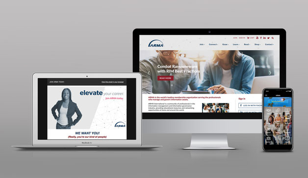
arma international | brand development
For ARMA International’s live conference (“The Power of I”), I created the full branding look and feel, including event app, print collateral, landing page, social assets, and static banners. The
vibrant, professional design used eye-catching colors and bold typography to energize the information governance community, building momentum and visibility across channels.


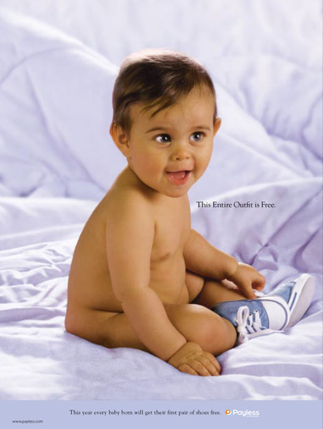
payless shoescource | package & print ad (awarded AOR status)
Payless ShoeSource Baby’s First Shoes Campaign. This awarded campaign was originally a project-based challenge from Payless ShoeSource. Our team pitched a campaign to expand reach to Hispanic audiences: free first shoes for every baby. My package design (one of three agency concepts presented to the client) sealed the win, earning Barkley Evergreen & Partners AOR status.
The emotional reveal featured baby footprints (like birth certificates) inside the box, forging an instant parent-brand connection. With this project, we expanded the business to include CTV, print, collateral, and packaging. The campaign drove strong results—leveraging my Latina perspective for authentic resonance.

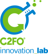
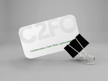
c2fo | whitepapers & company business cards
Brought on as a contractor and later full-time, I helped define and launch C2FO’s brand across all channels, establishing credibility for a fast-growing fintech startup. I led execution,
including company-wide photography, employee merchandise, sales collateral, foil-stamped business cards, global fulfillment across the U.S., UK, and EMEA, social, and a new website. The work
helped shift perception, build momentum, and attract new partners. A personal highlight was creating a playful, liquidity-themed baby onesie that became part of official employee swag.
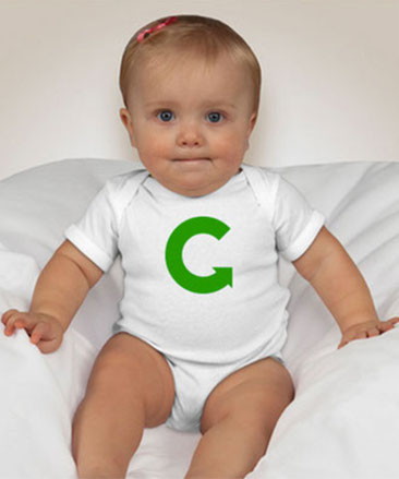

c2fo | baby onsie employee gift
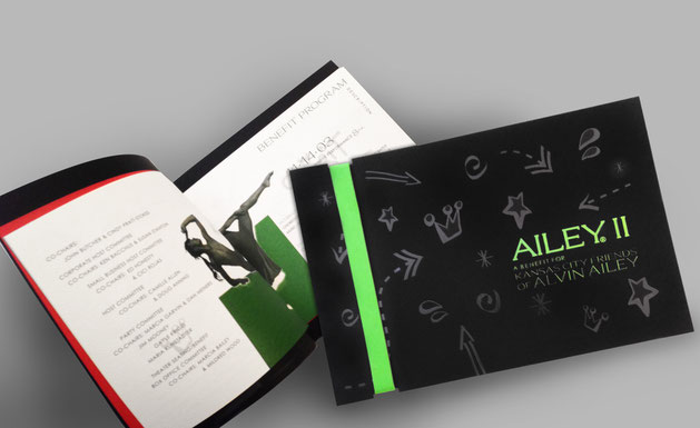
ailey || | collateral
Ailey II is the acclaimed second company of Alvin Ailey American Dance Theater, blending modern, jazz, and ballet with African American cultural expression to showcase technical mastery and emotional depth in contemporary works.
For this benefit gala, I designed a tactile invitation using foil stamping, embossing, and richly textured paper to mirror the company’s layered artistry. The piece carried a gritty street-edge aesthetic that aligned with Ailey’s history, and our entire agency hand-assembled each invite, turning production into a collaborative celebration, with all artwork illustrated by me.
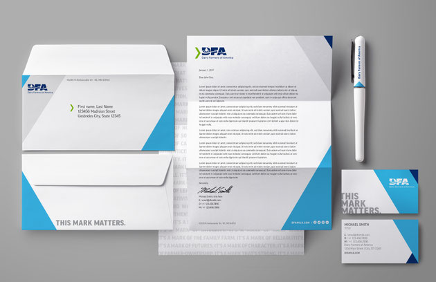
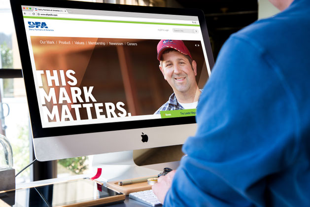
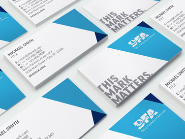
dairy farmers of america | stationery
While contracting for Barkley, I created DFA's corporate stationery system as part of the "The Mark Matters" campaign, which celebrated the pride, purpose, and commitment of their farmer-owners. I also applied the new branding across the website and multi-media touchpoints, ensuring a cohesive visual identity that connected consumers to DFA's legacy of quality and sustainability.
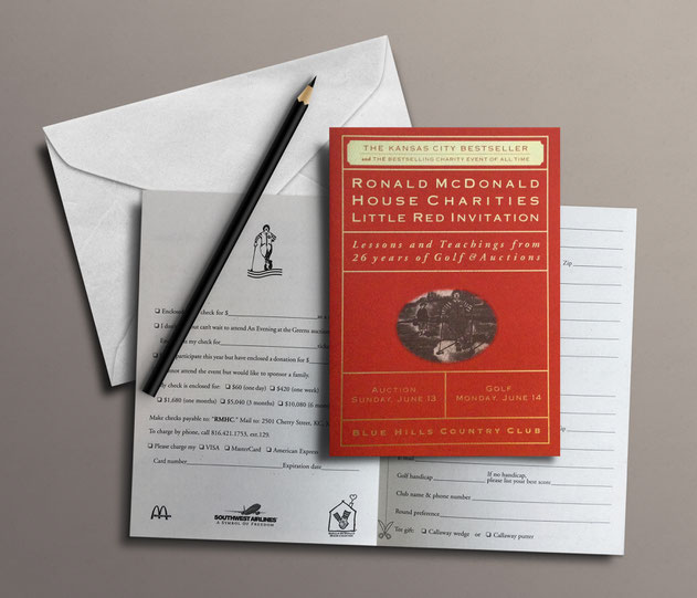
ronald mcdonald house charities | auction invitation
Ronald McDonald House Charities of Kansas City keeps families close to their seriously ill children by providing lodging, meals, and support just steps from local hospitals.
For this charity golf auction, I created a keepsake invitation inspired by Harvey Penick’s classic Little Red Book, illustrating the cover and advocating for tactile paper that felt as special as the event itself. The piece played off golf culture in a warm, clever way, resulting in an invitation for guests to actually hold on to elevating both the auction experience and the organization’s story.

cef of kansas | gaudeamus logo, invite & postcard
For CEF’s signature Gaudeamus fundraiser ("Let Us Rejoice"), I designed a vibrant invitation using the same signature colors as the year-round branding campaign, but with an elegant flair and custom event logo that brought the gala’s joyful spirit to life in its own unique style.
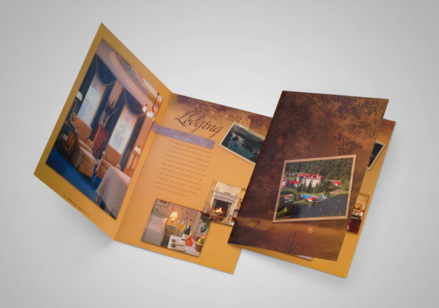
the balsams | collateral
The Balsams Resort in New Hampshire’s White Mountains boasts a storied history as one of America’s grand hotels, famous for hosting presidents and being the first place to project presidential election results nationwide. This was my first branding project at MMGY (before it became MMGY Global) and the property that ignited my passion for travel advertising. I created banners, brochures, and print collateral blending the resort’s historic legacy with its major renovation—nodding to its “Dirty Dancing”-era timelessness while inviting a new generation to experience its unplugged magic, where even phone service was just a flagpole away. The campaign tracked exceptionally well, drawing fresh clientele to the revitalized icon.

greater kansas city foundation | awards invite
The Greater Kansas City Foundation manages numerous scholarships for local students through its academic portal, supporting diverse community efforts including those tied to Hispanic initiatives.
As a freelance project, I created this vibrant awards invite announcing scholarship winners, featuring my signature graphic cut-paper art inspired by Hispanic cultural influences. The colorful
branding was well received and celebrated for its authentic connection to the community.
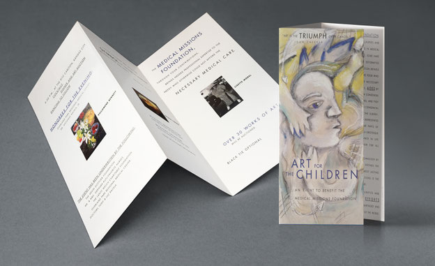
medical missions | collateral
Medical Missions Foundation harnesses the healing power of art alongside medicine, sending volunteers—including artists—to bring joy to underserved children through murals, crafts, and
performances on global missions, while auctioning kids’ artwork at their flagship “Art for the Children” fundraiser. As an artist myself, I created a custom mixed-media painting (gouache and
graphite on newsprint) for their brochure, nodding to the auctioned pieces and aligning with the event’s spirit. The client loved it so much that they kept the original as a leave-behind gift.
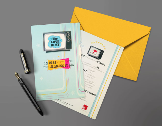
nicholson kovac | invitation
Nicholson Kovac, the Kansas City advertising agency where I worked, was a creative powerhouse that ran for 40 years before closing. To celebrate their 40th anniversary with the industry
community, I designed an interactive direct-mail invitation playing off 1981 nostalgia (the year they started) with a wheel chart revealing era logos that culminated in theirs. The piece proudly
nodded to NK’s direct-mail legacy, delighting the owners and perfectly capturing their brand story.

ronald mcdonald house charities | auction invitation

catholic education foundation | collateral
The Catholic Education Foundation (CEF) of Kansas City partners with 23 schools in the Archdiocese to provide scholarships for at-risk students, making Catholic education accessible to all
backgrounds. As their long-term freelance artist, I developed vibrant new branding including custom illustrated icons, while designing the look and feel across their website, social channels, and
multi-media assets throughout the year—plus art-directing a video with my former boss, Scott Loewin, and creating Gaudeamus gala invitations, postcards, and shareholder collateral.

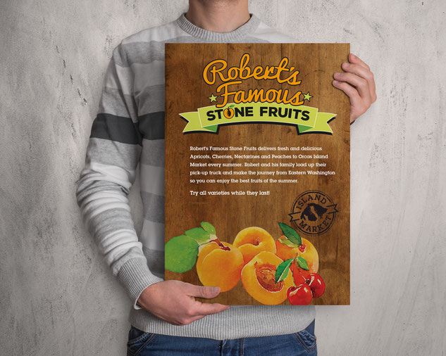
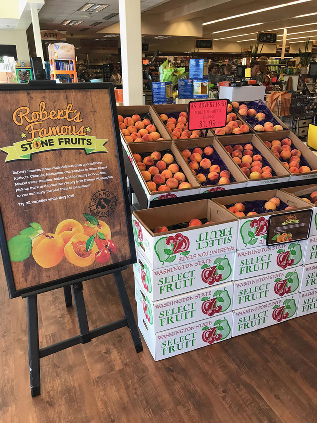
orcas island market | producer of the month poster
For Orcas Island Market's "Producer of the Month" poster series (part of the full brand identity on my print + digital page), I designed an internal grocery store display featuring my original
watercolor artwork to spotlight island producers, bringing the store's friendly, community-driven spirit to life through custom visuals that celebrated local makers.
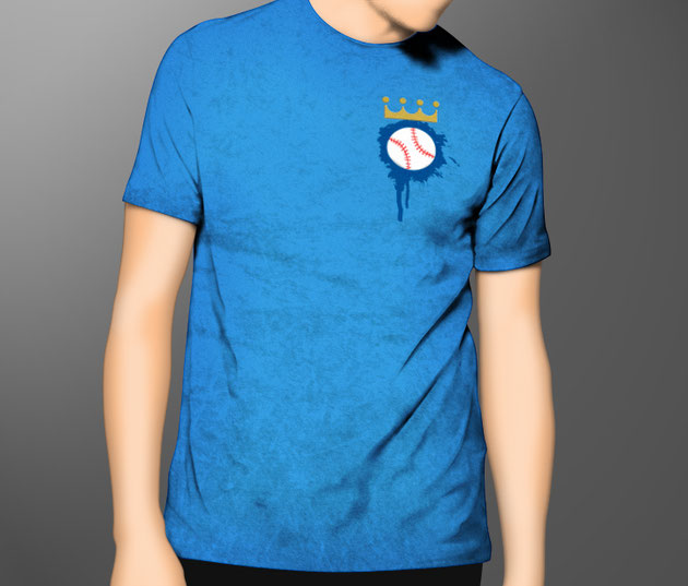
royals | promotional giveaway
Growing up loving baseball and the Royals—collecting vintage tees with Frank White, George Brett, and others sold at Amoco gas stations—I poured that passion into this promotional T-shirt
giveaway while on VML's internal Version studio team. A dream project working on the Royals account, the concept captures how I bleed Royal-blue in this town. The design came straight from the
heart and was loved by the team.
logos