sweargirls creative

destination ann arbor | different kind of different campaign
Ann Arbor is not just one place but seven forward-thinking, proudly local communities that come together unlike anywhere else, creating a different kind of different. This campaign uses a bold polygon graphic to suggest energy that cannot be contained, with visuals subtly breaking out of the shape and a fun, vibrant color palette that highlights the area's quirky, come-as-you-are spirit across print, digital, carvertising, and experiential storefront video.


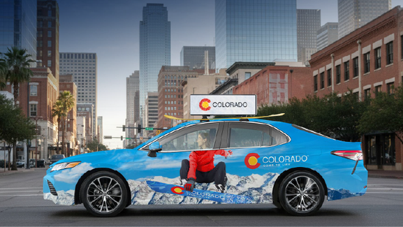
colorado | ski + snowboarder car wrap
This concept started as a simple car wrap and evolved into a full-on Colorado “snow takeover” at the Kansas City Chiefs vs. Dallas Cowboys game in Arlington, Texas. The wraps turned each car into
a moving slope, with a skier or snowboarder flying down a snowy mountain, perfectly aligned so the driver’s head became the athlete’s head when viewed from the side windows. A rooftop video
topper completed the scene, starting with a snowball hitting the screen and then disappearing to reveal the CTO logo embedded in frosty ice. Inside, the experience continued with the scent of
pine, crackling fire video on in-car screens, and skis or a snowboard mounted on top, immersing Texas fans in light, fluffy Colorado snow and turning the activation into memorable guerrilla
marketing the client loved.

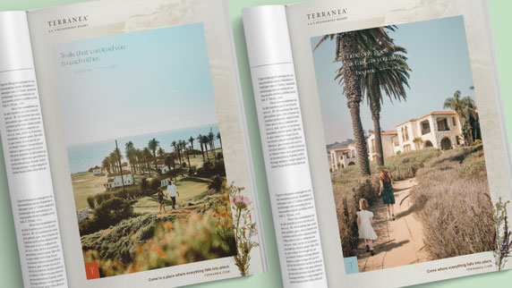
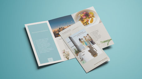
terranea oceanfront resort pitch work | become___one campaign
Developed a proposed brand system for Terranea, a luxury California resort known for its vast oceanfront views, farm-to-table cuisine, and immersive sense of calm. The identity drew directly from
the landscape, incorporating dried flowers and twigs gathered from the coastal paths into the design, with an earthy, elegant color palette inspired by native plants and the Pacific horizon. The
concept extended to a digital outdoor board with location-based messaging, offering extended-stay promotions to nearby guests and reinforcing Terranea as a place to linger, not just visit for a
day.


inspiration board for campaign title primary palette & logo concept
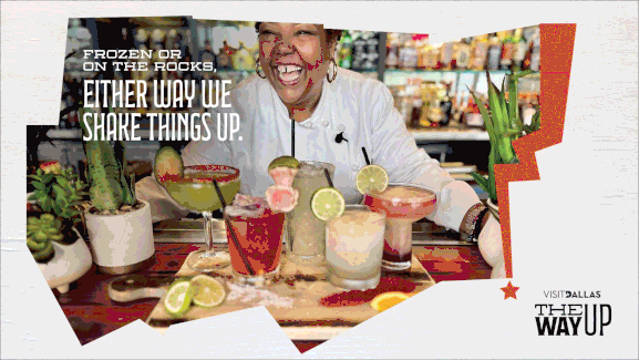

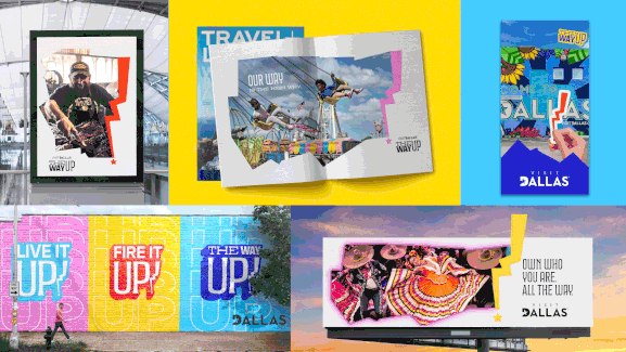
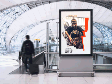
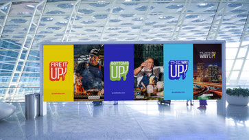
visit dallas | the way up campaign
For this new business pitch, the branding centers on the bold silhouette of the Dallas–Fort Worth Metroplex, the heart of North Central Texas, used as a signature graphic to celebrate pure Dallas
pride. The right edge of the shape forms a lightning bolt, becoming a bright exclamation mark in an electric, primary color palette that embodies the city’s unapologetic energy. Photography is
candid, not forced, capturing real maverick moments that feel lived-in rather than staged. The system flexes across print, social, digital banners and out-of-home, all built around one simple
idea: Dallas only moves one direction. The way up!

south dakota | emails
These biweekly branded emails for South Dakota were a chance to blend design and illustration, using custom artwork to add emphasis to each section’s content.


rapid city | baby onesie
This quirky client gift played on the historic role of buffalo chips in Rapid City’s high prairie past, when settlers burned them for fuel. The client loved the level of detail, especially the buffalo graphic cheekily placed on the back of the baby onesie, turning local history into a playful keepsake.

bvi | something to celebrate campaign
Developed the “Something to Celebrate” campaign for BVI Tourism as the islands emerged from COVID-19 after rebuilding from a hurricane. The work celebrated the British Virgin Islands as a serene, unspoiled escape, highlighting the pride islanders feel for their home and their warm, welcoming spirit. Through refreshed branding across display banners, social, and print, the campaign invited travelers to share in BVILOVE—a way of life that connects people, honors resilience, and makes the BVI feel truly special.


These biweekly branded emails for South Dakota were a chance to blend design and illustration, using custom artwork to add emphasis to each section’s content. For this Thanksgiving send, the header featured an original animated pumpkin pie, with the whipped cream sculpted into a playful nod to Mount Rushmore, a wink to one of the state’s most beloved family destinations.